Suppose we have an image, and we implement it as below:
<img src="images/coffee.jpg" alt="a cup of coffee">img {
width: 200px;
height: 200px;
}If the image the original size is a rectangular image, the image would be look vertically squashed like below:

solution => we use the object-fit property:
img {
	width: 200px;
	height: 200px;
	object-fit: cover;  /* it covers its containing box */
}
so the image would be rendered as below after applying the new style:
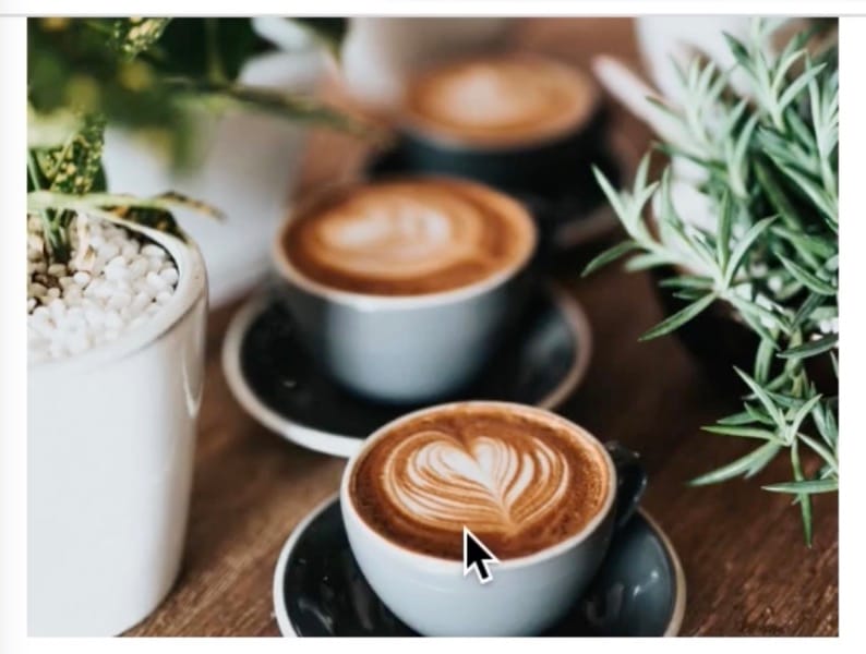
we can also try other values to assign to object-fit property. if we set the object-fit to scale-down, it would look like:

AI version below:
Mastering Image Display in CSS: A Complete Guide to Preventing Image Distortion
Have you ever added an image to your website only to find it looking squashed or stretched? This is a common challenge in web development, but fortunately, CSS provides powerful tools to help maintain image quality and proportions. In this guide, we’ll explore how to fix distorted images and create visually appealing layouts.
The Common Problem: Squashed Images
When working with images in HTML, simply setting fixed dimensions can lead to distortion, especially when the original image has different proportions. Let’s look at a typical example:
<img src="images/coffee.jpg" alt="Coffee cup on a wooden table">img {
width: 200px;
height: 200px;
}With this basic setup, a rectangular image would appear squashed because we’re forcing it into a square container without considering its original aspect ratio. This is where the object-fit property comes to our rescue.
Understanding object-fit
The object-fit property is a powerful CSS feature that controls how an image should be resized to fit its container. Here are the key values you can use:
1. object-fit: cover
img {
    width: 200px;
    height: 200px;
    object-fit: cover;
}
This is often the most useful setting because it:
- Maintains the image’s aspect ratio
- Fills the entire container
- Crops the image as needed while keeping the focal point centered
- Perfect for thumbnails and profile pictures
2. object-fit: scale-down
img {
    width: 200px;
    height: 200px;
    object-fit: scale-down;
}
This option:
- Displays the image at its original size if it’s smaller than the container
- Scales down the image proportionally if it’s larger
- Never scales up the image
- Ideal for preventing image quality loss
3. Other Useful object-fit Values
contain: Ensures the entire image is visible while maintaining aspect ratiofill: Stretches the image to fill the container (similar to not usingobject-fit)none: Maintains original size, potentially causing overflow
Best Practices and Tips
- Choose the Right Value for Your Need
- Use
coverfor hero images and thumbnails - Use
containwhen showing the entire image is crucial - Use
scale-downfor product images or when original size matters
- Use
- Combine with
object-position
img {
    width: 200px;
    height: 200px;
    object-fit: cover;
    object-position: center top; /* Controls focal point */
}- Consider Responsive Design
img {
    width: 100%;
    height: auto;
    max-width: 200px;
    object-fit: cover;
}- Accessibility Considerations
- Always include meaningful
alttext - Consider users with slow connections
- Test how images render at different screen sizes
- Always include meaningful
Browser Support and Fallbacks
Modern browsers have excellent support for object-fit, but for older browsers, consider these fallbacks:
/* Fallback for older browsers */
.image-container {
    position: relative;
    width: 200px;
    height: 200px;
    overflow: hidden;
}

.image-container img {
    position: absolute;
    top: 50%;
    left: 50%;
    transform: translate(-50%, -50%);
    min-width: 100%;
    min-height: 100%;
}

/* Modern browsers */
@supports (object-fit: cover) {
    .image-container img {
        position: static;
        transform: none;
        object-fit: cover;
    }
}
Common Use Cases
- Profile Pictures
.profile-pic {
    width: 150px;
    height: 150px;
    border-radius: 50%;
    object-fit: cover;
}- Hero Images
.hero-image {
    width: 100vw;
    height: 50vh;
    object-fit: cover;
    object-position: center 30%;
}- Image Galleries
.gallery-image {
    width: 300px;
    height: 200px;
    object-fit: cover;
    transition: transform 0.3s ease;
}
Conclusion
Properly handling images is crucial for creating professional-looking websites. The object-fit property provides a simple yet powerful solution to common image display challenges. By understanding and appropriately implementing these CSS properties, you can ensure your images look great across all devices and screen sizes.
Remember to always test your images across different devices and browsers to ensure consistent presentation, and consider implementing fallbacks for optimal cross-browser compatibility.
