When designing web layouts, a common requirement is to have text wrap around images, similar to what you might see in magazines or newspapers. This effect is achieved using CSS’s float property, and it’s a fundamental technique that every web developer should understand.
The Problem
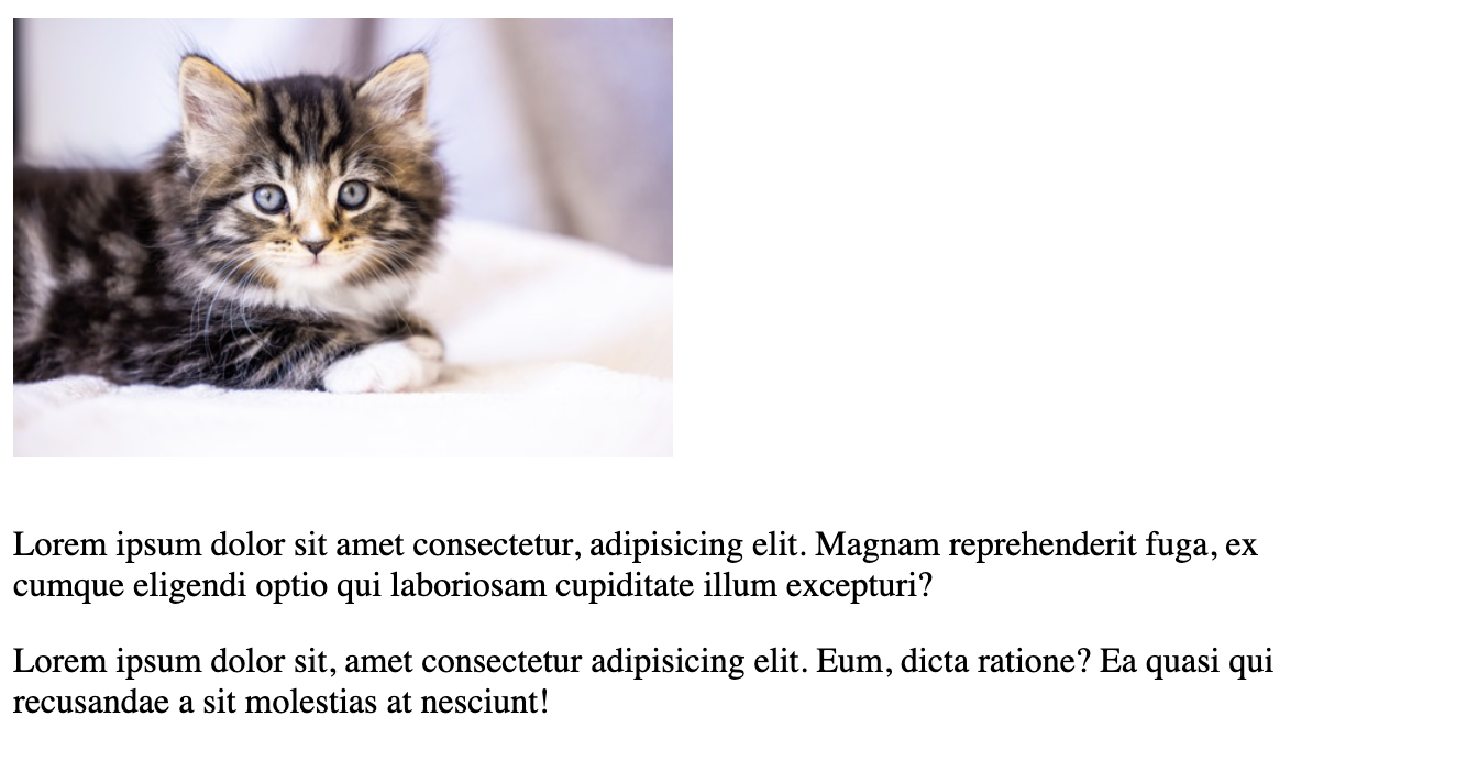
By default, HTML block-level elements like <img> and <p> stack vertically, each taking up the full width of their container and appearing on new lines. This creates a rigid, column-like layout that might not be ideal for content presentation.
Here’s how it looks without any styling:
<div class="container">
  <img src="example-image.jpg" alt="Sample image">
  <p>First paragraph of text that appears below the image...</p>
  <p>Second paragraph that also appears below the image...</p>
</div>.container {
width: 600px;
margin: 0 auto;
}
img {
width: 200px;
height: 200px;
}This creates a layout where each element occupies its own row:
+----------------+
|    [Image]     |
+----------------+
| First paragraph|
| text...        |
+----------------+
| Second         |
| paragraph...   |
+----------------+
The Solution: Using Float
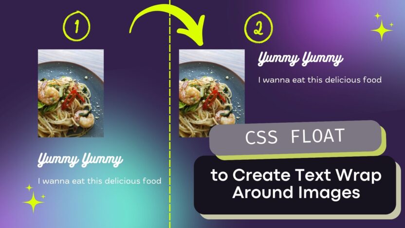
By applying float: left to the image, we tell the browser to push the image to the left side of its container and allow subsequent content to flow around it. This creates a more natural, magazine-style layout.
Here’s the modified CSS:
.container {
  width: 600px;
  margin: 0 auto;
}

img {
  width: 200px;
  height: 200px;
  float: left;
  margin: 0 15px 10px 0; /* Add some spacing around the image */
}
The result is a layout where the paragraphs wrap around the image:
+--------+-------------+
|[Image] | First       |
|        | paragraph   |
|        | text...     |
|        |             |
|        | Second      |
|        | paragraph...|
+--------+-------------+
Why It Works
When you apply float: left to an element:
- The element is moved to the left side of its container
- It’s taken out of the normal document flow
- Following elements will wrap around it rather than starting on a new line
- The floating element will remain part of the document flow horizontally
Best Practices
- Always add margin to the floated image to prevent text from touching it directly
- Consider using a clearfix solution if you have content that should appear below the floated elements
- Be mindful of responsive design – you might want to remove the float on smaller screens
Complete Example
Here’s a full working example:
<!DOCTYPE html>
<html>
<head>
    <style>
        .container {
            width: 600px;
            margin: 0 auto;
        }

        img {
            width: 200px;
            height: 200px;
            float: left;
            margin: 0 15px 10px 0;
        }

        p {
            margin: 0 0 15px 0;
            line-height: 1.5;
        }
    </style>
</head>
<body>
    <div class="container">
        <img src="example-image.jpg" alt="Sample image">
        <p>Lorem ipsum dolor sit amet, consectetur adipiscing elit. Sed do eiusmod tempor incididunt ut labore et dolore magna aliqua. Ut enim ad minim veniam, quis nostrud exercitation ullamco laboris.</p>
        <p>Duis aute irure dolor in reprehenderit in voluptate velit esse cillum dolore eu fugiat nulla pariatur. Excepteur sint occaecat cupidatat non proident.</p>
    </div>
</body>
</html>
This example demonstrates how a simple CSS property can dramatically improve the visual presentation of your content by creating a more natural flow between images and text.
Note: Just saying …
While float is indeed an older CSS technique, it’s worth understanding the different approaches and when to use each:
- Float (Traditional)
- Introduced in CSS1
- Still valid for specific use cases like text wrapping around images (its original purpose)
- Simple and widely supported
- Good for content-first approaches, especially in CMS content where you want text to naturally flow around images
- Modern Alternatives:
a) CSS Grid
.container {
  display: grid;
  grid-template-columns: auto 1fr;
  gap: 15px;
}- Better for overall layout structure
- More control over alignment and spacing
- BUT doesn’t allow text to naturally wrap around images
- Better suited for structured layouts like sidebars, card layouts, etc.
b) CSS Flex-box
.container {
  display: flex;
  gap: 15px;
}- Great for one-dimensional layouts
- Like Grid, doesn’t achieve the natural text wrap effect
- Better for navigation, card layouts, centering content
c) CSS Shapes
.modern-approach {
  float: left;
  shape-outside: circle(50%);
  clip-path: circle(50%);
}- Modern enhancement to float
- Allows text to wrap around complex shapes
- Less supported than traditional float
When to use what:
- Use
floatwhen:- You specifically need text to wrap around images
- Working with content-heavy sites like blogs or news articles
- Need maximum browser compatibility
- Use Grid/Flexbox when:
- Creating structural layouts
- Need precise control over spacing and alignment
- Don’t need text wrapping around elements
- Use CSS Shapes when:
- Need creative text wrapping effects
- Working on modern, artistic designs
- Browser support isn’t a critical concern
Modern Best Practice:
The modern approach is to use the right tool for the specific job:
- Grid/Flexbox for layout structure
- Float for text wrapping
- CSS Shapes for advanced text wrapping effects
So while float might be an older technique, it’s not “outdated” – it’s just more specialized now. For the specific case of making text wrap around images (which was its original purpose), it’s still the most straightforward and appropriate solution.
Think of it like this: Just because we have power tools (Grid/Flexbox) doesn’t mean a regular screwdriver (float) is obsolete – each has its proper use case! And in this example I personally prefer not to use the float approach and use other modern best practices instead.


